Beast of Burden
The brilliant doctor behind my favorite obscure website
My friend Dr. Chris Murray wants to treat everyone. And I mean everyone…

The first time I met Chris Murray, he was wrestling with a big question. It was in the early 2000s, and Chris was working at the World Health Organization in Geneva. I was in town for some meetings at the WHO and heard from Chris about a project he was working on. He wanted to understand: Why do people get sick and die?
It wasn’t a philosophical question. He meant, What are the biggest causes of death and disability? How does HIV compare with strokes or road injuries or suicide or back injuries? How do the answers change over time and in different countries?
As Chris would explain a few years later: “Nobody would imagine starting out on a long journey without knowing where they're going and what route they would take. Yet, if you look at global health, that was where the world was—huge ignorance about what people died from.”
Chris told me he wanted to create a comprehensive database that would answer those questions, and make it available free online. It was obviously a big challenge, both scientifically and politically. But I thought that if he could pull it off, it would be a fantastic tool for everyone who cares about these issues. And it became clear that Chris—a compassionate scientist with a love for hard data and software—was the right person to take it on.
Chris went on to spend a few years on the faculty at Harvard University; when he left in 2007, I jumped at the chance to help bring him to the University of Washington, where he set up the Institute for Health Metrics and Evaluation. A few years later, Chris and his team launched the project he had been dreaming of: a comprehensive update of the Global Burden of Disease, or GBD, using data from researchers around the world. They also built some very cool data visualizations with the information and analysis from the GBD.
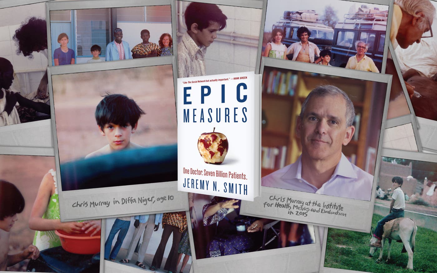
Chris’s story is told well in Jeremy Smith’s book Epic Measures: One Doctor. Seven Billion Patients, which came out earlier this year. It’s a highly readable account for anyone who wants to know more about Chris’s work and why it matters. As Smith says, it is “the story of a huge independent effort, years in preparation, to do nothing less than chart everything that threatens the health of everyone on Earth, and make that information publicly available to doctors, health officials, political leaders, and private citizens everywhere.”
I visit the GBD data visualizations a few times each month. It takes a while to get good at finding your way around the tools, but once you do, they are amazingly informative. There are more than a billion entries in the database, covering several hundred causes of death and disease. Recently Melinda and I were trying to understand suicide rates in different countries—and how they differ among men and women—and we quickly found the information we were looking for. (It turns out that in some countries the male/female gap is more than 5 to 1, while in others it is more like 1 to 1.)
The idea behind Chris’s work is simple: We can’t cure what we don’t understand. If we know what the biggest killers are, we can make sure our efforts to save lives are aimed at the right things. And we can learn what works. In this TGN post you can watch Chris use the GBD to explain how setting goals and measuring progress has helped drive huge gains in health—which is one reason I’m optimistic about the new Global Goals being adopted this month at the United Nations. (Melinda and I will be there to help spread the word about the goals.)
What I love most about the GBD is the way it democratizes information. Much of the data was available previously, but it was scattered around the world—buried in various countries’ databases and in printed reports that gathered dust on office shelves. The GBD brings it all together, synthesizes it, and makes it available to everyone. Thanks to input from experts around the world, it keeps getting more accurate. It is slowly becoming the standard go-to resource for health data in rich and poor countries alike.
Epic Measures gives you a good sense of why all this is so important. Smith writes, “With a truly all-encompassing view of life and death, we can see for the first time if Europe is healthier than America, or Iowa than Ohio, or you than your neighbor. And then in what ways. And how people are responding, with specific details everyone else around the world can try to emulate.”
I agree—and I would add that the GBD is another example of how technology is making it easier to save and improve lives everywhere. As Epic Measures shows, the more we make sure reliable information gets out there, the better decisions we all can make, and the more impact we all can have.


